

We start by looking at some general characteristics of wind generation in New South Wales, South Australia and Victoria. The AEMO data are actual generation for semi-scheduled wind farms in each state at five minute intervals from September 1 2015 to 16 January 2017. Data for the 28th through the 30th of September 2016 were removed due to the South Australian blackout.
The data are then averaged over half hourly intervals and the standard deviation in wind generation was calculated for each interval. The standard deviation over six five minute intervals is being used as a measure of variability that occurred over half an hour, as opposed to a statistical measure of the expected dispersion of possible outcomes within that half hour. The data were then smoothed to show how wind generation evolves over time.
The smooth of wind generation is shown in Figure 14. The time span over which AEMO wind generation is available online is limited, so the smooth is over the full data range. Consequently, the beginning and the end of the smooths should be regarded with caution. Nevertheless, the similarity of the seasonal pattern in each state is very clear. The differences in wind generation in each region are due, in large part, to installed capacity. Further, one additional generator came on line in South Australia in late June 2016, adding 102 MW of capacity which is also evident in the figure.
The smoothed standard deviation of wind generation in each half hour interval is shown in Figure 15. Again, the seasonal pattern is similar in each region. The greater variability of five-minute wind generation in South Australia is consistent with the greater level of wind generation and a positive correlation in output from wind farms. The average correlation across South Austrian wind farms over the period was 58 per cent with a range of 18 to 94 per cent. Although wind has a strong seasonal component, the increase in the volatility of wind generation the second half of 2016 in South Australia may again be consistent with the increase in capacity that occurred over this time.
These smoothed trends provide a picture of how the profiles of wind generation have changed over time and help to explain why wind generation, at five minute intervals, is correlated across New South Wales, South Australia and Victoria, as shown below:
· SA – NSW 29%
· SA – VIC 54%
· NSW-VIC 48%
The variability of wind generation, which may change over half hourly and longer time scales, can only be anticipated and managed in a probabilistic way. From a non-technical perspective, there are two elements that shape the management problem. First, there is less flexibility to respond the shorter the time scale. Second, most the deviations about what is expected may be small and managed at a low cost while more extreme outcomes will be infrequent but costlier to accommodate. To get a sense of this we should look at wind generation from a distributional perspective. While interest is in volatility will start with the distribution of the level of generation in each region.
Figure 14. The trend in half hourly wind generation in New South Wales, South Australia and Victoria: September 1 2015 to 16 January 2017

Figure 15. The standard deviation of half hourly wind generation in New South Wales, South Australia and Victoria: five minute intervals: September 1 2015 to 16 January 2017.

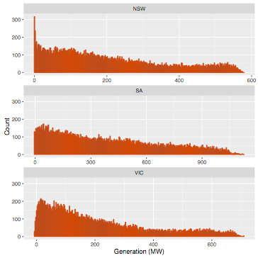
The distribution of wind generation in each state is shown in Figure 16. The distributions are all strongly skewed to the right with a fat tail. So, while low and even zero levels of output quite common there still are relatively frequent high levels of generation. South Australia has a longer and fatter tail. The former is due to greater capacity but the fatter tail is likely to reflect a difference the wind resource. New South Wales has a substantial number of zero generation intervals and Victoria more low generation intervals when compared to South Australia.
Figure 16. The distribution of the change wind generation in New South Wales, South Australia and Victoria: September 1 2015 to 16 January 2017.
Turning to time scale of volatility, we can compare the in the change in wind generation between five and 30 minute intervals. The distribution of the change between five minute intervals is shown in Figure 17 and for 30 minute intervals in Figure 18. The spread of both the distributions is considerably wider (less peaked) in South Australia compared to Victoria which in turn is substantially wider than in New South Wales. While the differences may be mostly due to installed capacity, the wind resource also seem to play a role particularly between New South Wales and Victoria.
Figure 17. The distribution of the change in wind generation, delta, between five minute intervals New South Wales, South Australia and Victoria: September 1 2015 to 16 January 2017.
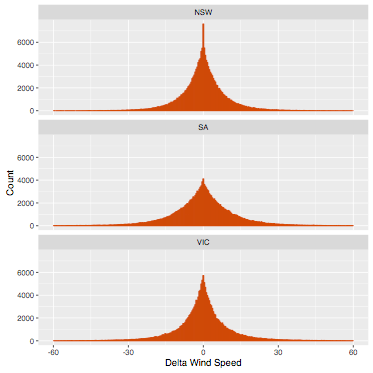
In moving from 5 to 30 minute intervals the change in the distributions is also quite striking. The range roughly doubles and the tails due fatten, especially in South Austria. This is due to the positive temporal correlation in the changes in generation through the half hour intervals. In other words, the five-minute changes tend to be more strongly negative or positive as opposed to random with the half hour.
The implications are a little easier to see in Table 3 in which the upper percentiles of the distributions are shown (the distributions are quite symmetric so the lower percentiles will roughly mirrored, the 1st per centile the opposite in sign of the 99th). In South Australia 10 per cent of the variation between five minute intervals was over 15MW. This more than triples to 48 MW between 30 minute intervals. This threefold increase is consistent through the upper percentiles in South Australia and there is a similar though smaller pattern of increase in the other regions.
The NEM maintains ancillary generation services to continuously manage very short term fluctuations in generation and load, referred to as regulation frequency control. Regulation is required because there is not sufficient time to adjust output through the dispatch of price and energy bids from generators. However, a lower level of variability can make this essential service more manageable and less costly to deliver. The converse is also true, as the level of reliability of the service needs to maintained.
The median supply of regulation frequency control in South Australia was 60MW which is more than the 99.5 per cent of variation in half hourly wind generation. The supplies of these services can be adjusted to meet anticipated increases in variability in generation and load. For example, in 20 per cent of the same period, the supply of regulation frequency control was over 100MW.
Figure 18. The distribution of the change in wind generation, delta, between 30 minute intervals New South Wales, South Australia and Victoria: September 1 2015 to 16 January 2017.

The greater level of variability in half hourly generation can be managed though the dispatch of higher and lower priced energy bids from generators. These prices and offers form the spot market for electricity generation. Consequently, variability in wind generation can impact on the variability of spot market prices. How big this impact will depend on the current state of the market. For example, four per cent of the variation in half hour prices in South Austria was between roughly 70MW and 120MW (the difference between the 95th and 99th percentiles). If over the corresponding times, there were available energy bids for this range of power close to the current prices, the impact would still be small. One can construct examples in which the impact would be large. The extent to which conditions promote high levels of price variability frame the empirical question of interest here.

However, the temporal correlation in wind generation can create different levels variability in output at longer and often irregular time scales. We can get a sense of this by looking at the deviation of wind generation about the trend in average wind generation (as shown in Figure 14). To do so we are going to use a much finer smooth of the deviations about trend as opposed to the trend itself as we are interested in capturing relatively short term patterns due to changes in wind velocity. Further, the regular diurnal pattern in wind generation over the period has been accounted for in the smooth to focus more on changing weather patterns. The results are shown in Figure 19.
The figures illustrate how temporal correlation can generate short, sharp and irregular cycles, referred to a ramp events when they occur in real time. The general pattern is again similar in each region, all showing a marked increase in volatility in 2016. However, South Australia clearly stands out not only in terms of the magnitude of the swings but the frequency with which generation moves from well above to well below trend.
The time scale of these swings is considerable longer the half hourly but their speed, severity and irregular nature may be more difficult to manage, at least in terms of cost, though the dispatch process. Picking the extremes or turning points in such conditions may be on the edge of impossible. The system just needs to be sufficiently resilient and that may, at times, prove costly.
At the same time, pattern of these large swings in wind generation in South Australia fit visually with the shift in the changing distribution of prices over time presented in the very first blog. While not a sound basis for drawing conclusions, the dynamics wind generation and prices in South Austria look to be worth investigating.
Figure 19. The trend and deviation about trend in wind generation in New South Wales, South Australia and Victoria: September 1 2015 to 16 January 2017.
