

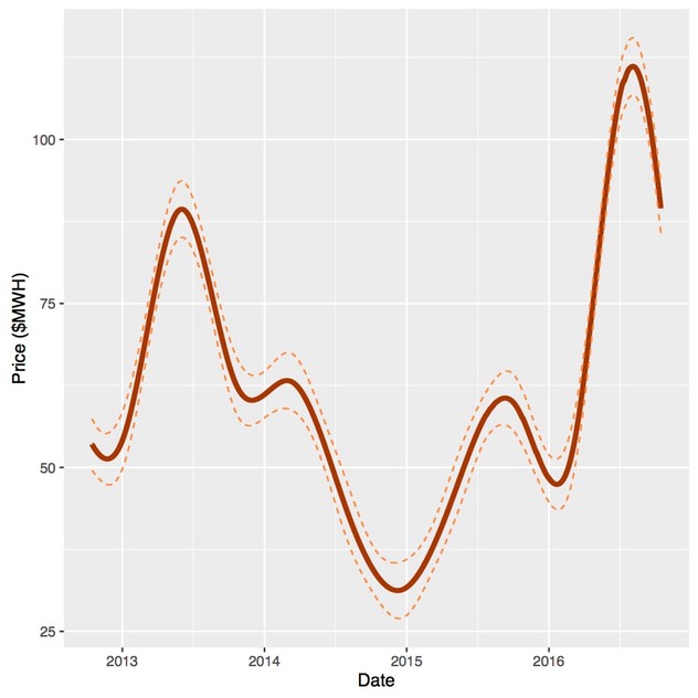
We start by smoothing out the variability in prices to obtain a trend in average prices in South Australia over the last four years which is shown in Figure 1. The smooth is an estimate of a conditional mean, or the average price at particular point in time. As with all estimates it is subject to error and the 95 per cent confidence bounds for the estimate are also shown in the figure. As the beginning and end of the smooth are not strongly support by the data, two months of data or approximately 2,900 observations are removed from the beginning and the end. So the data used in the smooth runs from mid-August 2012 to through mid-December 2016 but is shown in the graphs for a shorter period. Nevertheless, the beginning and the end of the smooths shown in the figures should still be viewed as being dependent on the period shown.
The idea behind the smooth is to show the underlying trend in prices at a meaningful time scale while retaining a reasonable degree of fidelity with the underlying variation in the prices over time. The impact of the carbon and tax and its repeal, a strong seasonal component and the surge in prices in 2016 are all quite evident. At the same time, hourly, daily and weekly variability is not.
Figure 1. Average prices in South Australia: 15 October 2012 through 15 October 2016
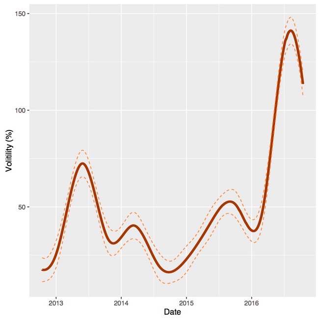
The price deviations from trend can be expresses as a percentage of the average price, which is a standardised measure of price volatility known as the mean absolute percentage deviation. We can smooth these deviations to get a picture of how price volatility has evolved over the last four years, as shown in Figure 2. The sharp increase in price volatility in 2016 as well as the overall seasonal pattern is quite evident. A visual comparison of Figures 1 and 2 shows a common pattern, high prices are associated with high price volatility.
Figure 2. Price volatility as measured by mean absolute percentage deviation in South Australia: 15 October 2012 through 15 October 201616.
Average prices and price volatility
The relationship between price volatility and average prices can be viewed from another perspective. The median price, or 50th percentile, is at the midpoint of the price distribution and should be pretty much unaffected by price volatility. However, the imposition and repeal of the carbon tax or an increase in gas prices will be clearly seen in the median. If the price distribution is symmetric (or evenly balanced about the median), the average price will be the same as the median price. However, as the relative frequency of high price events increases the average price will be driven above the median.
Average and median prices over the last four years are shown in Figure 3. It is interesting to note that median prices increased in 2016 to about the same level as when the carbon price was imposed, perhaps reflecting higher gas prices. However, what is also clear is that during peak price periods the divergence of the average from the median has become more pronounced.
Figure 3. Median and mean prices in South Australia: 15 October 2012 through 15 October 2016

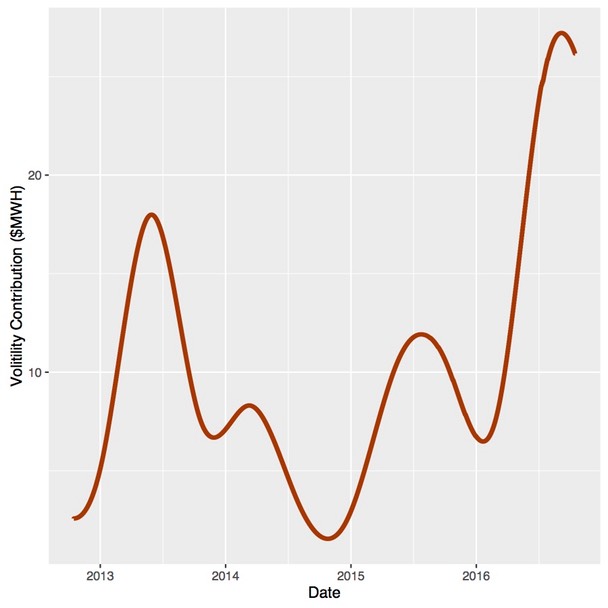
The difference in the average and media price, shown in Figure 4, is a rough measure of the contribution of high price volatility to the average price. It appears that during seasonal peaks, upside price volatility makes a substantial contribution to average prices, rising to over $25/MWh in mid 2016.
Figure 4. The contribution of price volatility to average prices in South Australia: 15 October 2012 through 15 October 2016
The distribution of prices
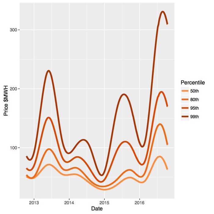
The techniques used to estimate the trend in median prices can be used to estimate how other percentiles of price distribution have changed. The trends 50th, 80th, 95th and 99th price percentiles for South Australia are shown in Figure 5. It is important to keep in mind the differences between the percentiles; that is, 30 per cent of all prices lie between the 50th and the 80th percentiles, while only 1 per cent of all prices are above the 99th per centile.
There are a few points to note. First, in peak seasons, the upper percentiles diverge from the median, particularly at and above the 95th percentile. However, in 2016 a larger proportion of the tail of the distribution shifted upward, as can be seen in the 80th percentile. This is concerning as it explains, in large part, why the increase in volatility has had such a large impact on average prices. Lastly, the 99th percentile appears to escalated sharply. This might be a bit concerning but the accuracy of estimation can decline quickly at upper quantiles and it will be interesting see if this trend persists into periods of 2017.
Figure 5. Trends in distribution of prices in South Australia: 15 October 2012 through 15 October 2016
If the increased volatility of prices persists or recurs in 2017, this will poses a serious challenge. Regardless of its cause, a substantial increase in average prices will be passed on to users. Such outcomes may be indicative of systematic problems within the electricity system, and any solution which will depend on the source or sources of the problem. Some further analysis is intedend to provide some insight into the potential causes.