While an increase in the variability of demand in South Australia may be a very unlikely source of the observed increase in the variability and consequent increase in prices in South Australia, there are other candidates. These include:
· the natural variability in dispatched wind generation in South Australia;
· transmission constraints in and out of South Australia; and
· variability in market conditions in other NEM regions that also affect South Australia.
Before looking look directly at the variability of dispatched wind generation in South Australia it is interesting to look at what has been happening in other states for a few reasons.
First we can see whether the problem is unique to or predominantly occurs within South Australia, or whether it is symptomatic of a wider problem across the Eastern Seaboard. This approach goes beyond addressing the third possible source. Wind generation accounts for a much larger proportion of dispatch in South Australia than it does in the other regions, so if the variability of wind generation is a driver of price variability, it should predominantly manifest in South Australia. Second, if price volatility is unique to South Australia, then it would be reasonably clear that whatever its source, the increased price variability it is not being passes through to the other regions. Third, if there is a similar pattern of prices and prices variability in other regions, this raises a critical question whether the problem affects the Eastern Seaboard as a whole, or whether what is happening in South Australia is impacting on other states.
Smoothed prices for the other NEM regions (excluding Tasmania) are shown in Figure 9, while corresponding levels of price volatility are shown in Figure 10. Queensland is shown in a separate panel as it is clear that different patterns in prices and price volatility prevail there. While there is a strong relationship between average prices and price volatility, as measured by the mean absolute price deviation about trend, we will keep the focus here on NSW, South Australia and Victoria.
From the two figures it is clear that the escalation of average prices and price volatility in 2016 has predominantly occurred in South Australia. However, there is a similar but dampened pattern in New South Wales and Victoria. This suggests that what is occurring in South Australia is either occurring in the other regions to a lesser degree or that what is occurring in South Australia is impacting across the system.
Figure 9. Smoothed prices in NSW, Queensland, South Australia and Victoria: 15 October 2012 through 15 October 2016.
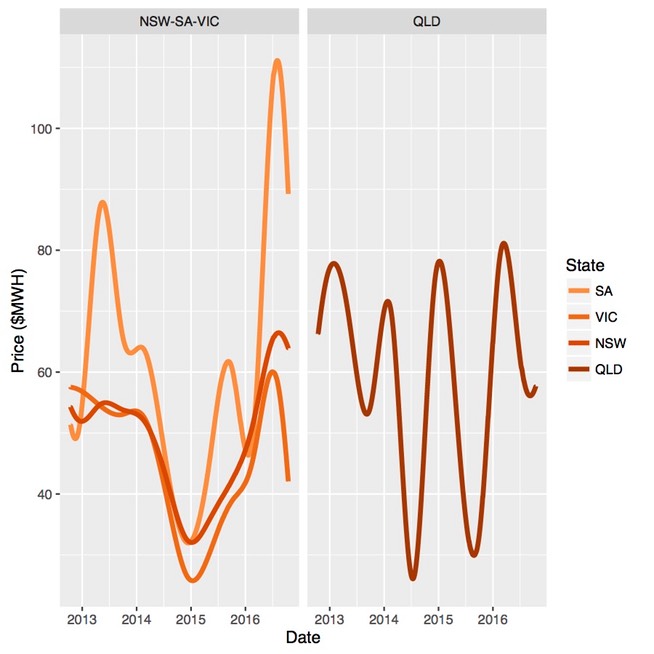
Figure 10. Price volatility in NSW, Queensland, South Australia and Victoria: 15 October 2012 through 15 October 2016.

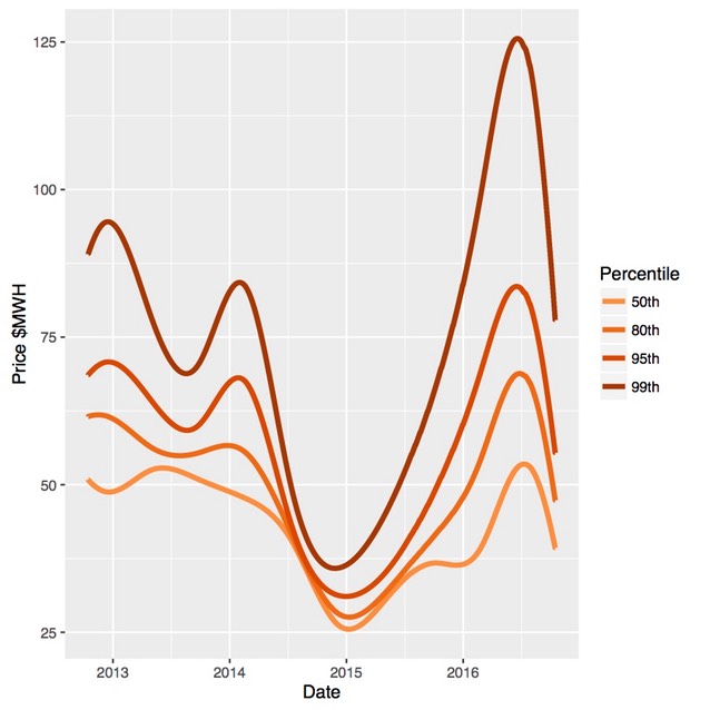
We can take a closer look at what has been happening to the price distributions in NSW and Victoria using the same quantile graph as was done for South Australia. The evolution of the distribution for NSW is shown in Figure 11 and in Figure 12 for Victoria. The same pattern emerged in 2016 in these regions, but on a different scale. This includes the shift of the 80th percentile which has not generally occurred in the past during periods of elevated price volatility. It is immediately apparent that the evolution of the price distributions in NSW and Victoria are very similar.
Figure 11. Quantiles of the electricity price distribution for NSW: 15 October 2012 through 15 October 2016.
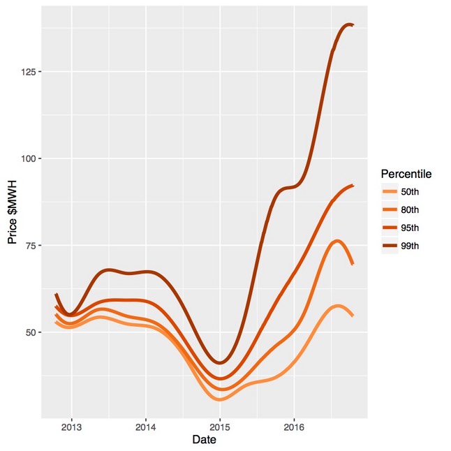
Figure 12. Quantiles of the electricity price distribution for Victoria: 15 October 2012 through 15 October 2016.
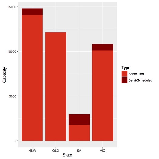
This does not resolve the question of whether increased price volatility is predominantly due to a system wide issue or is localised in South Australia. However there are two clear differences in the generation profiles of NSW, South Australia and Queensland as can been seen in Figure 13. South Australia has relatively high proportion of wind generation which is a debated potential source of price volatility. Two, South Australia represents a relative small proportion of total generation and as such might not have a substantive impact on the rest of the grid. This brings to the forefront the question of causality.
Figure 13: Installed and committed scheduled and semi-scheduled generation capacity